

Friday, 28 May 2010
Variations..
From feed back i have, i have changed the layouts of the fingerprints to make them look more spontaneous. It works really well and the everything looks well. The layout now of the fingerprint gives the feel i was always looking for and i feel i have achieved this. Composition is a big thing here and i think it has been achieved.
Friday, 21 May 2010
Evaluation of FMP
DNA:
Arch, curves & similarities
Evaluation of final major project
For my final major project I have adapted a fingerprint theme from the overall topic of DNA. For my final outcomes I have created five type posters based on five fingerprints taken of my family and also including mine. They are typography posters and they contain information inside about various information on DNA. At first I planned to do an animation but I scrapped the idea because I did not see any reason to include it, when I was focusing on five major final designs, and I feel these will be more ascetically pleasing then an animation as well. My aim was to look at the similarities between the fingerprints and see if they look the same. Through the research I did I found out that family’s fingerprints are similar. When I was taking the fingerprints, I used red for female and blue for the males, this was because when showing the original documents I want to show masculine and feminine in my family.
This made me want to show this through my type posters and I highlighted the similarities in a different colour on the poster. The five posters themselves are very intricate and were outlined very detailed in Illustrator, this detail allowed me to be able to place the text on the patterns created very freely and conform to the lines. The illustrating process was good for me because I became more confident in using Illustrator and learnt a lot more about the program itself.
The colours I used were a basic colour scheme and included blues, whites and generally looking medical colours. I chose these colour schemes because I like how subtle it was and that it related to a DNA theme. The body text is various sizes and various typefaces in each this is so that they can look different next to each other when displayed.
I enjoyed designing these and the medical research I done as well as the artist research helped me to develop my ideas. I took some inspiration from Damien Hirst because I liked the way he laid out his medical designs but I did take my composition into consideration because I did not want it to look overcrowded with words or lines.
In this project there has been no constraints however time has been an issue because I procrastinated at the start because I was in two different minds about ideas but when I realised what idea I wanted I made sure I utilised the time I had. If I could re-do the project I would probably take time into consideration and try to do as much research as possible at the start to help kick start the project, also I would try and limit the information in the fingers because there is a lot of information to take in but I suppose the more in there the more better I can convey my meaning of DNA as well as my idea.
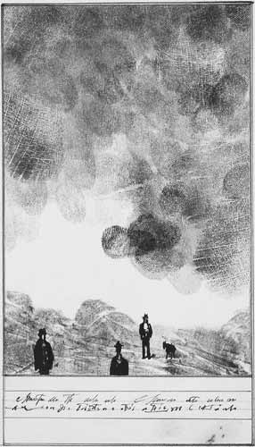
Saul Steinberg Ext Reserach
Here are some work done by Saul Steinberg based on fingerprints. The work is good, and its a very interesting composisition of fingerprints. He has used fingerprints to tell stories.
They work really well together.


They work really well together.


Finals (5)
I have done my final designs and also included the changes i wished to put in. The outcomes work really well and i have all the pictures completed of my family.


Futurism
This was a movement that took place in the 20th century. It had parrallel movements in the images. The Futurists practiced in every medium of art, including painting, sculpture, ceramics, graphic design, industrial design, interior design, theatre, film, fashion, textiles, literature, music, architecture and even gastronomy.
Futurism was full of colours and that is why i have chosen to mention it.
Futrurism is full of lines and colour combinations that work well together. The early stuff is the good looking stuff.


Futurism was full of colours and that is why i have chosen to mention it.
Futrurism is full of lines and colour combinations that work well together. The early stuff is the good looking stuff.


Fingerprint Art in your living room ??
Looking through the internet i have come across a website that allows you to send your fingerprint in and they will create artwork from your fingerprint.
http://www.dna11.com/gallery_finger_prints.asp
This is a new and unique way to portray a fingerprint, i mean how interesting as the website says why have the same piece of artwork when no one has the same fingerprint.
http://www.dna11.com/gallery_finger_prints.asp
This is a new and unique way to portray a fingerprint, i mean how interesting as the website says why have the same piece of artwork when no one has the same fingerprint.
Henri Matisse
In class we watched this documentry about the artist Henri Matisse. His work was really good and really simple. His early work was very surreal and colourful and was detailed but as he got older and frailer his work started to become based on shapes and simple pictures because of his health.
Colour wise he was briliant with his uses he would look at the colours on the colour wheel the teridary colours and used them in his work.
It was very important to look at the colur uses in ma FMP because the wrong colours will give out the wrong message.
here are some examples of Matisses's work:


His work is simply done and beautiful images have been created.
Tuesday, 18 May 2010
final change.
as my objective was to show how similiar family fingerprints can be i have chnaged the designes to show this similarities. I will do this by highlighting certain parts of the text with one colour that resemble each fingerprint.
This is a good idea that was put forward and i am changing the designs to fit this. i have one more left, and pictures will be up soon.
this is turnin very successfull = )
This is a good idea that was put forward and i am changing the designs to fit this. i have one more left, and pictures will be up soon.
this is turnin very successfull = )
Wednesday, 12 May 2010
Other Reserach
Mark Farrow
Lookin through my blog i have missed out on some realy important research most of which to do with medical things on different things such as CD packaging. A cd package that was very interesting was designed by Mark Farrow called Spiritulised and it was based on a paracetomol/pharamocotical product. It was designed really well and was a intertesing way to portray a CD.


Also here is some other stuff designed by Mark Farrow and was for an album called Songs In A & E, it is again linked to medical things. It has differnt needles which was based on someone haveing loads of needles coming out of there arms..hmm very interesting.


Here is also another design by Farrow and was related to the illness phenoimia.

Wednesday, 5 May 2010
2nd Final Poster

This looks to be the second poster a final one. = )
just need to get it checked over. but overall this is how i want this one to look, i like the colour schemes in it and also it focuses on a different part of DNA included in the text.
Subscribe to:
Comments (Atom)
